A few examples of projects that we have been commissioned:
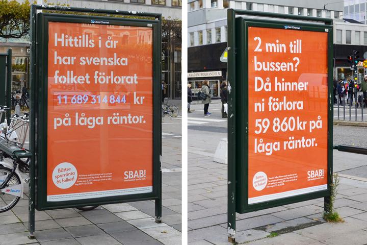
The design agency Le Bureau had sketched with Futura as the new corporate identity typeface for financial institute SBAB, but at the same time they wanted to have a unique custom corporate typeface. We were then commissioned to let ourselves be inspired by Futura as a sort of visual template, and then design the new weights Regular and Bold plus italics, and also a separate new Bold weight in a stencil manner. We produced the new typeface family both for print and for the web.
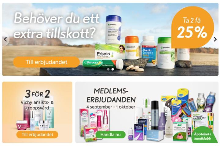
The design agency JVD sketched the basic design for a new ad typeface for the pharmacy chain Apoteket, we vectorized and fine-tuned all glyphs and produced two complimentary weights. For the same client we also produced their new corporate identity typeface, consisting of three weights plus italics, and for the design agency Intellecta we have also produced a new all-caps headline typeface for the same client (Apoteket Service).
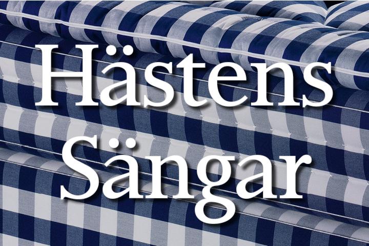
A long time ago we produced a version of the historical typeface Pilgrim (actually mostly for our own pleasure), which at the time was not available in digital format, based upon photoset originals produced by Typografen, which we then scanned, vectorized and fine-tuned. The typeface was then stuck in the archives until the design agency Stockholm Design Lab asked specifically about Pilgrim for their client the bed company Hästens Sängar. We completed the typeface with an italic and the result was lovely, although regrettably it is no longer in use...
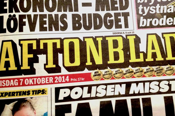
The newspaper head for Aftonbladet was only available to them as a logotype. We were commissioned to fine-tune the glyphs in the logotype, complete the alphabet with all missing all-caps glyphs, and produce a new typeface containing both separate outlines with drop-shadows and separate fillings. By combining a capital filling (without spacing) on a lower-case key with the corresponding capital outline/drop-shadow (with fit spacing) on an upper-case key, it is now easy to produce any subsidiary newspaper names (such as Sportbladet) set in bi-coloured text (just as the newspaper head logotype).
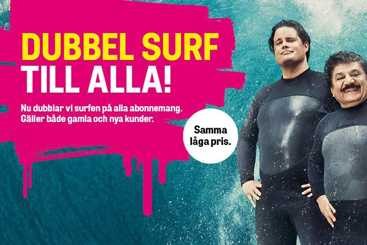
The design agency Kurppa/Hosk had found a typeface with a lot of quirks that they liked, but they wanted to design a brand new corporate identity typeface for their client the tele-company Comviq. We were then commissioned to design a new unique typeface but with some inspiration from this other typeface. Initially we designed and produced two new weights with italics, and after a year or two we completed the family with an additional middle weight with an italic.
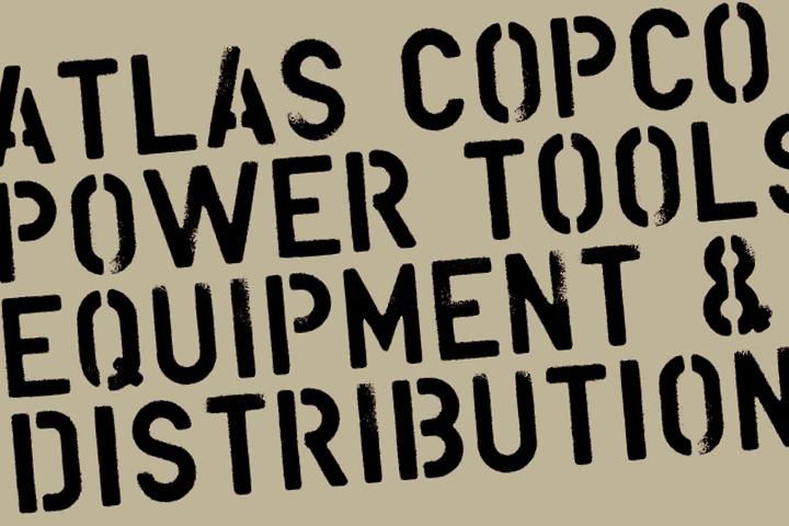
The design agency Welinder commissioned us to produce an all-caps font in a stencil manner, including alternative glyph variants for a more dynamic expression, for their client the multi-national tool and machinery company Atlas Copco. The basis material were sprayed letters which we then scanned, vectorized and created a new typeface from.
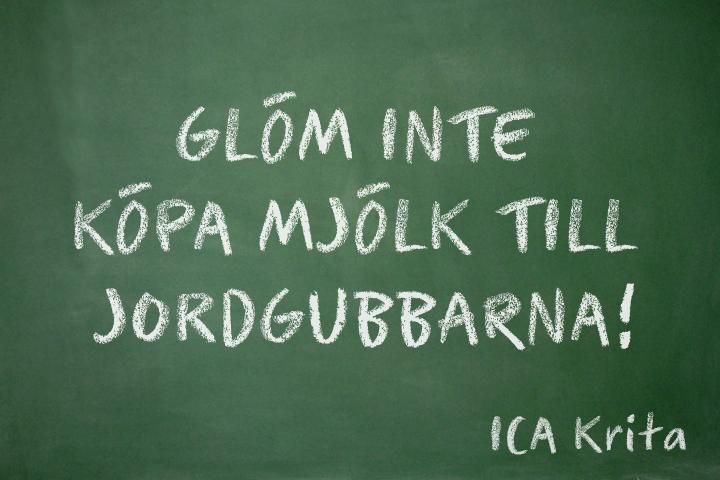
We received hand-drawn sketches from the design agency JVD, which we then scanned and vectorized to produce a new typeface. The sketched material was drawn with chalk, and the challenge consisted of being able to reproduce this manner as natural as possible, so that it would appear for the human eye that the final printed messages really were written by hand...
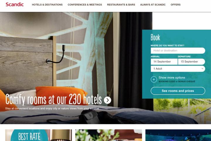
The design agency Honesty had chosen a hand-drawn all-caps script typeface for Scandic Hotels, but wanted to extend this with lower-caps as well. We contacted the foundry in Brazil and received their written approval of designing and adding this to their font. We also completed the font with extended language support for the Cyrillic (Russian) alphabet, for both upper-case and lower-case (“majuscular and minuscular”), and also designed alternative glyphs for all characters in order to vary the appearance and provide a more dynamic expression. Finally we programmed the font with a couple of OpenType scripts that provided automatic glyph rotation, so that any given glyph is never repeated next to itself.
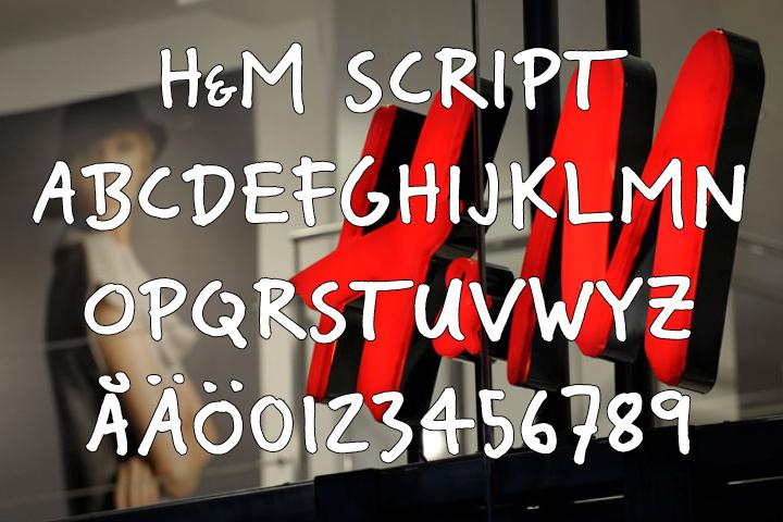
We received hand-written Illustrator-material from the design agency Silver, who wanted to use a new script typeface for their client the multi-national clothing company H&M, which we then fine-tuned and created a new typeface from. Throughout the years we have been involved in producing many other typefaces on commission from H&M directly, but have always set out from existing work, hence we will not show any further samples here.
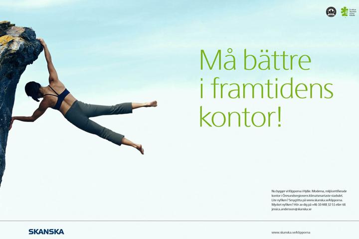
The design agency Brindfors Enterprise IG presented their new design concept for Skanska to us, we shared our input, and in a co-joint effort we sketched our way through to the final typeface design. Initially we designed the weights Regular and Bold (with extended Latin language support), later on we added a Light weight to the family (commissioned by Skanska directly), and even later we also added a Black weight (commissioned by the design agency CJH).
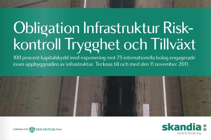
We were commissioned to produce the new bold brand name typeface (used to write all company names and trademarks) for the insurance company Skandia, and later on also their new corporate identity typeface (the weights Regular and Bold with extended Latin language support, one version with spacing optimized for headline use and one version for body text). The basic design work was made inhouse at Brindfors Enterprise IG, and we then fine tuned the design, completed with missing glyphs and produced the final font masters.
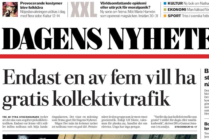
The design agency Pangea was commissioned by the newspaper Dagens Nyheter (DN) to design a brand new Bodoni typeface for headline use, and came to us to co-operate in the development of this typeface. Together we visited Uppsala University where we gathered inspiration from the studies of old original Bodoni prints (and yes, we had to wear gloves :-). Örjan Nordling at Pangea made sketches by hand, which we then vectorized, fine-tuned and sent updates back and forth until the design was finalized, glyph by glyph. In all we co-designed and produced four new weights (Light, Regular, Bold and Extra Bold), and Regular was later completed with a beautiful italic which was designed by Carolina Laudon.
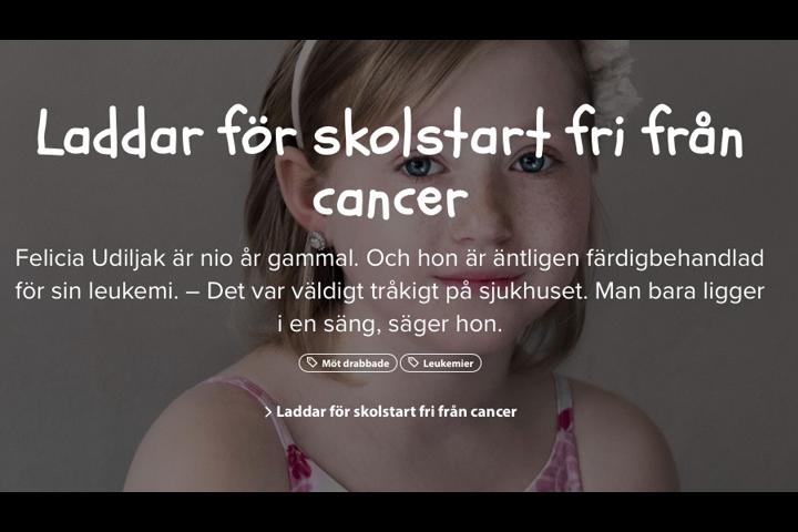
Barncancerfonden (The Children’s Cancer Foundation) were using signs that were only available as hand-written originals, and now needed a similar-looking typeface. The design agency Intellecta found a free font which was very close in design, which they then commissioned us to modify and make bolder to further match the hand-written material, with the final result making the difference negligible.
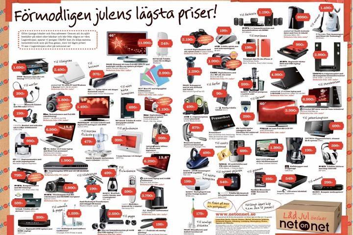
The design agency Garbergs commissioned us to produce a new campaign typeface for the electronic whole-sale company NetOnNet, based upon inhouse sketches of a hand-drawn script alphabet. We then scanned, vectorized, fine-tuned and produced the new master font.
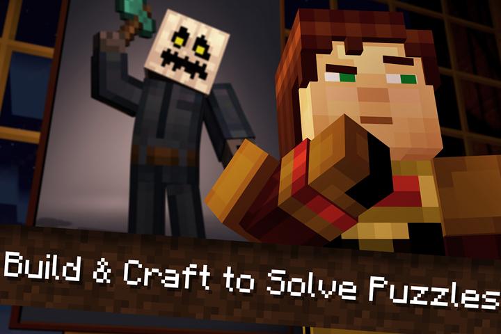
We received a few glyphs in a bitmapped manner as design sketches, directly from the Swedish computer game company Mojang (which is behind the international success game Minecraft), and were then commissioned to finalize the glyphs and complete the alphabet. In total we produced four new fonts of different widths and weights in the same bitmapped manner (the purpose of this design concept was to reproduce the same “block feeling” which is used in the game’s computer graphics).
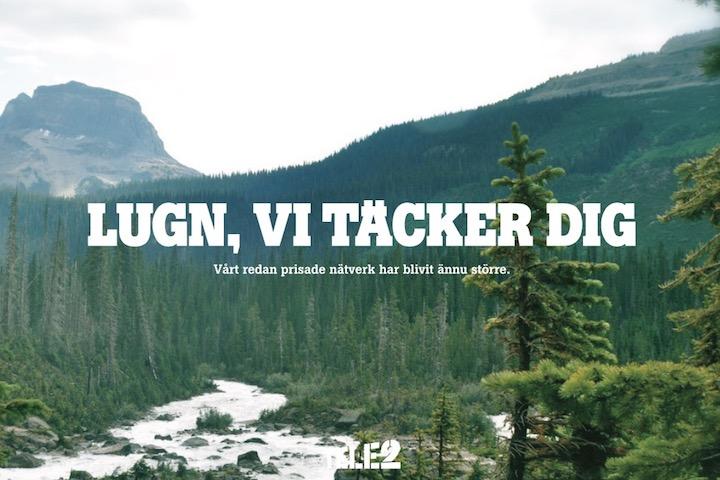
With Tele2’s current slab serif typeface as the underlying design concept, Tele2’s design agency Kurppa/Hosk commissioned us to design a brand new custom corporate typeface for Tele2, which resulted in the two weights Regular and Bold plus italics, one version with spacing optimized for headline and one version for body text. Later on we also added Cyrillic (Russian) language support for all four fonts, and also completed the family with an extra bold all-caps Heavy weight (intended for headline use only).
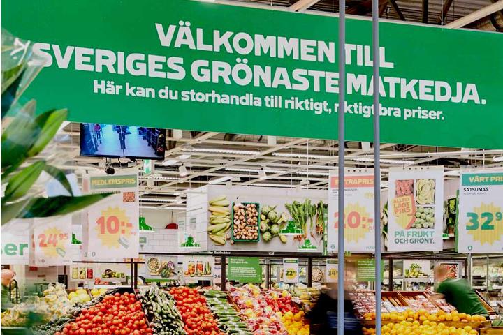
For many years we have been involved in producing different typefaces for Coop. Our latest project consisted of an order from the design agency Grow where we were commissioned to further develop the hand-drawn Black weight and also complete this with two new thinner weights, Regular and Bold.
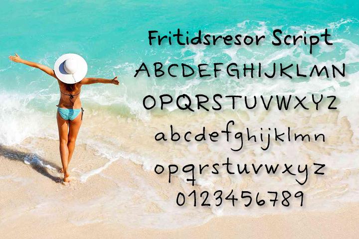
The design agency Collaborate supplied us with hand-written and vectorized Illustrator-material, to be used for the travel company Fritidsresor, from which we then created a new typeface and also completed with a new bold weight.
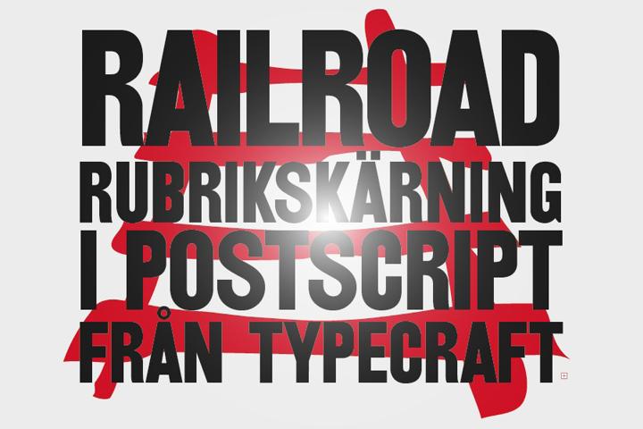
The old wooden typeface Railroad suddenly became in demand by our design agency clients around the mid-90s, hence we decided to produce our own version, which we have since sold a number of copies of. Today Railroad is available from many different foundries, but if you should stumble upon this font in Sweden it could very well be our old version...
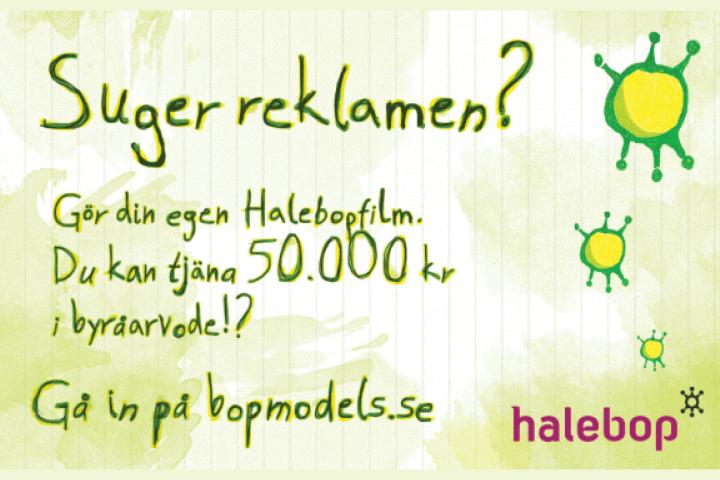
The design agency Honesty provided us with hand-written and vectorized Illustrator-material, from wich we selected three variants of each glyph, which would then be used to overlap each others in the three solid colours yellow, green and grey. The intent was to mediate an impression of a sketchy and scribbly hand-written manner to match the message and target group (urban young people). We also completed the typeface with a bold weight as well.
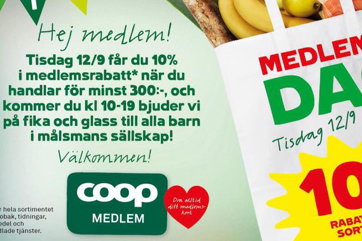
The design agency Garbergs provided us with hand-drawn sketches, we scanned, vectorized and produced a new typeface with many interconnections and multiple (triple) ligatures. The new typeface Gröna Konsum Script (for the grocery chain Konsum) were then used nation-wide in stores, on signs, on plastic bags -- pretty much everywhere. Today the typeface has been inherited by Coop, which at the moment is still using the typeface as a part of their graphic identity.
Our very first commissioned custom corporate typeface project from way back in 1990! The bank Sparbanken had hired a New York based designer who hand-drew a new all-caps typeface in connection with the complete re-design of the bank’s corporate identity (with a new logotype and everything). We received the hand-drawn original, scanned and vectorized all the glyphs, and produced our very first unique corporate identity typeface.
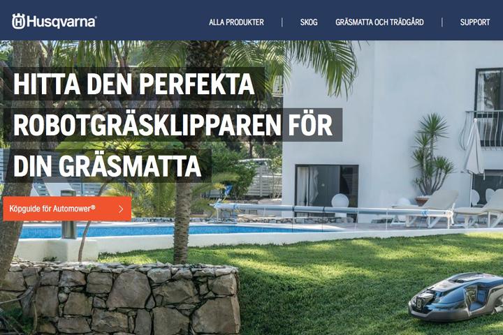
The design agency DDB commissioned us to design a new corporate identity typeface for Husqvarna. Together we worked through the requirements before we decided on the basic design principles for the new typeface. We then drew the typeface, sent sketches back and forth to DDB and Husqvarna for approval, and finally produced a complete family in three weights plus italics, with support for the Latin alphabet (for all European languages) as well as the Greek (modern) alphabet and the Cyrillic (Russian) alphabet (for all European languages plus some Asian languages), both for print and for the web. Indeed one of our most extensive commissions to date.
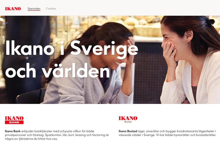
The design agency JVD supplied us with sketches and instructions for a new custom corporate typeface for the financial company Ikano (a subsidiary of IKEA), we then designed and produced the three new weights Light, Regular and Bold (plus an italic Light weight) with subtly rounded corners for a slightly softer expression. We supplied the fonts both for print and for the web.
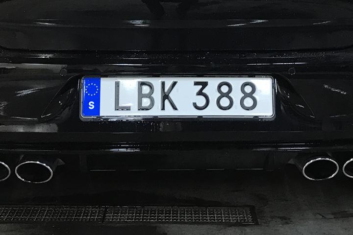
The state agency Transportstyrelsen had received complaints from the police that their various OCR systems had trouble reading current vehicle registration plates. Hence Transportstyrelsen contacted us and confided in us to design the new typeface that is now used for all new Swedish vehicle license registration plates. Alas, the plate production system in use put some constraints on a typographically optimal design, and we had to make various design concessions to compensate for the lackluster plate production system – but at least the police were happy with the result.
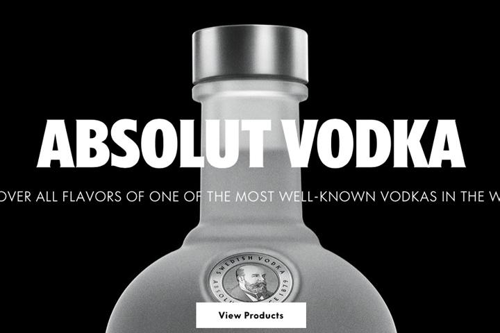
The design agency The Brand Union commissioned us to produce three new weights with four complimentary italics (of which one was back-slanted, hence four...), plus two condensed weights and one engraved weight, all ten fonts both for print and for the web (the latter also with extensive manual hinting). The basis was their client the licqor company Absolut’s former corporate typeface Futura, but with the instruction to achieve a more contemporary touch with influences from the humanist grotesque.
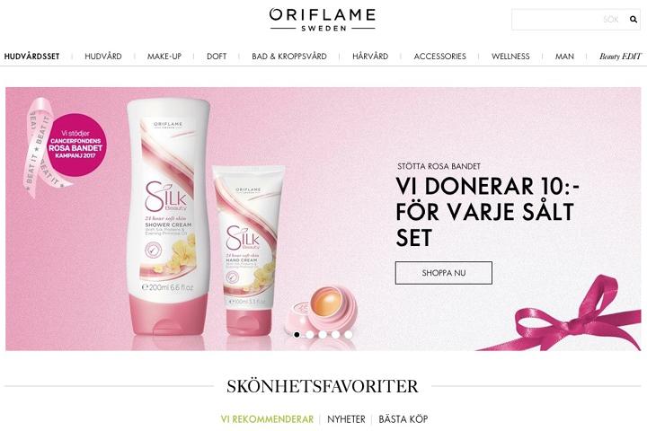
Oriflame had been using Futura as their corporate identity typeface when they commissioned us to design and produce a brand new custom typeface following the same design principles. Our work resulted in the new weights Regular and Bold plus italics, with extended language support for the Greek (modern) as well as the Cyrillic (Russian) alphabet. We supplied final masters both for print and for the web, where the latter were manually hinted for optimal screen rendering of the highest quality.
A list of more than 120 companies, organisations and government agencies that have received their own CID typefaces produced by us (above we only show a few examples):